Skip to content

New Website

A quick blog post this week as I’ve been working on getting a new portfolio/blog on the go. This was one of my goals for the year and shouldn’t have been too hard since I started working on it back before Christmas, but it did take a bit longer than expected.
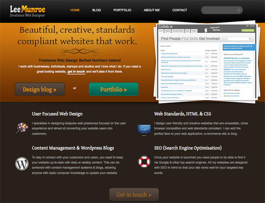
Old site

old.jpg

New site

new.jpg

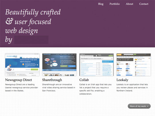
I wanted a minimal, light-weight site that was more blog focused, while also experimenting with some CSS3 niceness.

I’ll follow up next week with a few notes on design decisions and techniques I’ve used.

Feel free to let me know what you think.

Want to read more?

    None related articles found

Psst! We're hiring an Interaction Designer at Kareo. Click here if interested.

Photo of Lee Munroe

Written by Lee Munroe.

Follow @leemunroe on Twitter for more articles on UX design.


8 Appreciated Comments

Add your comment

  1. Lee says:

    One other thing, I couldn’t decide on a logo so ended up using plain text and hiding it until rollover.

    This goes against basic usability principals as it requires an interaction for the user to know whose site they are on but thought I would experiment with it. If you think it’s pants just say ;-)

  2. Michael Martin says:

    Looks great Lee, love the typography everywhere on it, beautifully done! :D

  3. David Rojas says:

    Looks really nice. Just one thing, now that you’re using CSS3, I would add some css transitions to the hovers, it’s a good plus (although only for webkit users).

  4. Marty Romero says:

    very nice work Lee. Love the minimalist approach

  5. Mark McCorkell says:

    It’s the risk factor I’m loving about this! And it’s the wee details like that rollover covering your name that will intrigue people when they land on a website, assuming they are fairly familiar with intuitive interfaces of course. At the same time though… I would be keen to see what logo you come up with, if you do decide to use one here.

    A designers website is like an open into what they’re all about, or at least it should be, so I always enjoy getting a peak at the way other designers do their personal sites.

    I like the way you have the homepage header colour changing for each time the user lands on the page. How many colours do you have in rotation there? And what way did you do that?

  6. Pete Hawkins says:

    Like the new site sir! Yes think you’ve done well, definately more blog focussed!

  7. Duy says:

    In general i like minimalistic web design more. But in this case i love your old design more ;)

  8. David says:

    Much prefare this design to the old one. Much more user focused and will function very well on iphone, ipad and other touch screen devices. This is something I have considered alot when re-designing my new site.