Skip to content

Checking Your Site For Visual Hierarchy

When a user visits your website, you have 5 seconds to grab their attention. Okay, maybe that’s not always true but none the less you want to make sure there’s a banana (banana being the key element you want your users to look at) to grab their attention.

You also want to make sure that visually your website has a hierarchy and is broken down in order of ‘importance’. Call to actions, H1s and H2s will fall under the more important elements, then H3s, H4s and links, then paragraph text and other images towards the bottom of the scale.

A user should be able to look at a page and instantly recognise this hierarchy. Now here’s a useful way to check if your hierarchy is as clear as you hope it is.

Blur your vision

Usually after designing a website I’ll use this technique to check for visual hierarchy. Look at the website and blur your vision. Yep, sounds a bit weird, but what you’re trying to see is if the elements you want to stand out still stand out.

Blur your screenshot

So that your eyes don’t get sore and to give you a bit more time to analyse it, take a screenshot of your website, bring it into Photoshop and give it a Gaussian Blur (Filter > Blur > Gaussian Blur) of 5px.

picture-5

Here are the results.
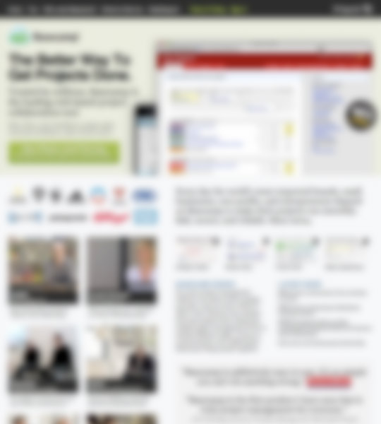
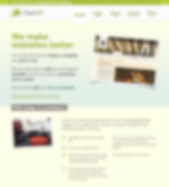
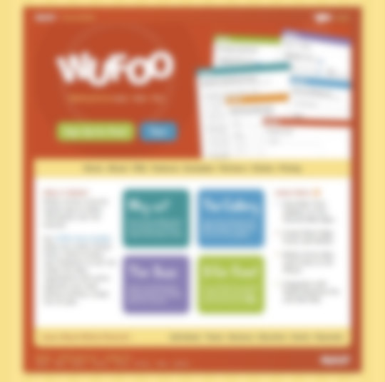
37.jpg
boag.jpg
fowd.jpg
ux.jpg
clearleft.jpg
wufoo.jpg
google.jpg

Does it work?

If you find you need to improve the visual hierarchy for different elements you can alter the following.

  • Size
  • Contrast
  • Colour
  • Shape
  • Position
  • Whitespace and padding

You could go one better and blur the screenshot by 10 pixels to see if your ‘banana’ still sticks out.

What do you think, does it work? Does it help?

Further reading

Want to read more?

Psst! We're hiring an Interaction Designer at Kareo. Click here if interested.

Photo of Lee Munroe

Written by Lee Munroe.

Follow @leemunroe on Twitter for more articles on UX design.


28 Appreciated Comments

Add your comment

  1. Marty Romero says:

    Awesome tip Lee. I usually squint my eyes, but the older I get the less effort I have to make to see things blurry. I don’t know why I hadn’t thought of this myself—probably because I’m getting old!

  2. Kevin Gibbons says:

    Nice technique, love the posts. Keep em coming!

  3. Cole says:

    Great tip – this was recommended by Cameron Moll at dConstruct a couple of years ago. another suggestion of his as well as blurring was to grayscale the image as well as blur it to really focus the visual hierarchy

  4. simonjs says:

    A superb tip! Thanks for sharing. I think Cole has a point about greyscale too.

    I’ll try them out.

  5. Andy Kleeman says:

    It should be noted that the same ‘bluring’ effect can be achieved by drinking several strong beers – achieved quickest on an empty stomach! – although accuracy of the results can be questionable ;)

    Nice technique Lee!

  6. Jordan Henderson says:

    Nice one Lee, good tip!

  7. Jack Osborne says:

    I’d never even thought about doing this before, great tip.

  8. Karinne says:

    Awesome tip! Never thought of doing that! Thanks!

  9. Lee says:

    @Cole: Nice suggestion, will try out greyscale next time.

    @Andy: I like your thinking!

  10. Semblance says:

    It seems to work with the examples you have used. I recognise the websites because of the good contrast they have. I will definitely remember this post… the figure of speech used, with the banana and all.

  11. rod rodriguez says:

    Nice tips here, hahaha, I’ll try this as soon as I get home… thanks Lee.

  12. Tylor says:

    This is and awesome! Although, it makes me a little dizzy looking at them…

  13. Frederik Van Zande says:

    Actually, it shouldn’t be completely grayscale. The human eye can still see a limited amount of colors when scanning.
    The way I mimick it is:
    1. copy the colored layer
    2. desaturate the copied color layer. (which is on top of the colored original)
    3. put the desaturated layer on 75% opacity (so 25% of the colored layer gets trough).
    4. copy paste the total effect & play with the blur.

    I never make a screenshot of it however. I play with the blur (gaussian), starting from 25px to 5px …
    It’s important to see the big area’s first, then focus on them & reduce the blur to see the elements which then pop out. Also you should only blur the viewport, doing the full webpage will give you totally different results !

  14. Codesquid says:

    A very novel way of testing your site! Visual hierarchy is essential for usability, I think. So many sites get this wrong!

  15. Don says:

    very cool. it’s like painting the local color with oils. it’s much easier to figure those colors out when you squint and blur or in my case, take your glasses off, hah.

  16. Bryan Jones says:

    what a fun and terribly useful idea. many thanks!

  17. Rafael Masoni says:

    Nice technique!

  18. sinsdesign says:

    I just tested your technique. Works for me! thanks

  19. Todd Toler says:

    Good thinking. Curiously, they say this is the same technique to appreciate a Rothko painting.

  20. Justin says:

    Instantly recognize the hierarchy? Wow, it that even possible? Maybe we should reexamine why we seem to think a user will leave if not instantly interested. Trust me, if a user is looking for something they will most likely stay until they find it. I’d be willing to bet that if you ask ten different people what the hierarchy is for a particular website you’ll get ten different answers. In the end it’s all about content; that’s what keeps people interested.

  21. Alex says:

    Good job dude, this is better than any tool!

  22. guidoguido says:

    Thanks! Good tip and it’s really useful. I’m used to walk around a lot when I’m designing, which has almost the same effect.

    As Cole already points out, grey-scaling works great as well. This also works the other way around, start in grey-scale and get your contrasts right.

  23. Pavan says:

    Great article. Such a simple idea to blur the page, I can see that being a great way of predicting what eye track markings would come up with in tests. I was led here from Design Informer. Here is a discount code for you and your friends or followers at http://www.seeinstyle.com:

    Agency74_FB1515

    Valid until March 23rd 2010. Would love your feedback on the site.

  24. cherylta says:

    Some great ideas here

  25. BN says:

    Cool tip!