I’ve seen a lot of designs lately experimenting with large type, and with the right choice of font, contrast and whitespace they look great.
Check out this inspirational list of typographic based designs that I’ve put together.
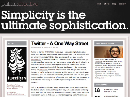
1. Pallian Creative
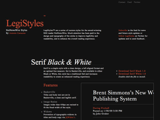
2. Legistyles
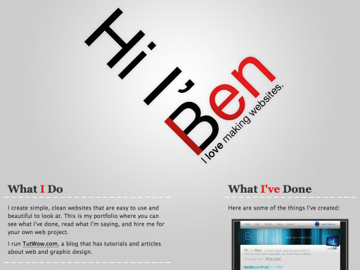
3. Ben Lind
4. Made by Cool

5. Lorem Ipsum

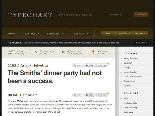
6. Typechart
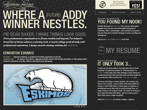
7. Elysium Burns
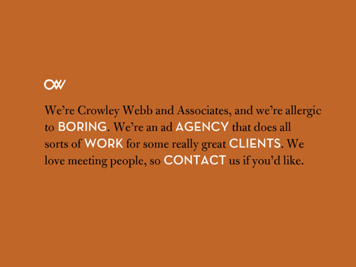
8. Crowley Webb
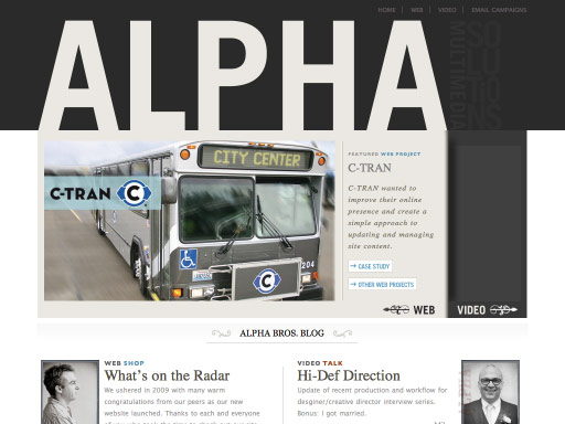
9. Alpha Multimedia
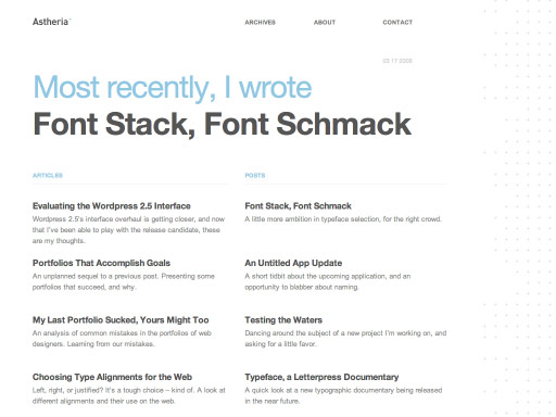
10. Astheria
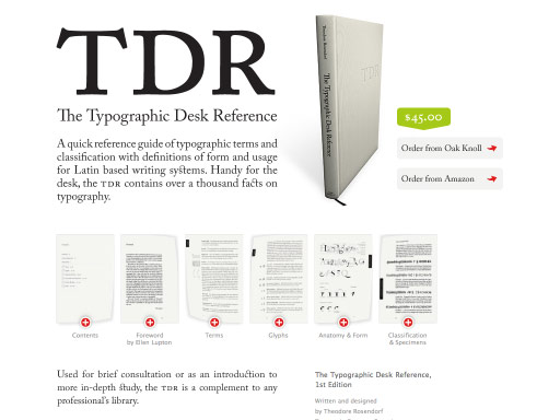
11. The Typographic Desk Reference
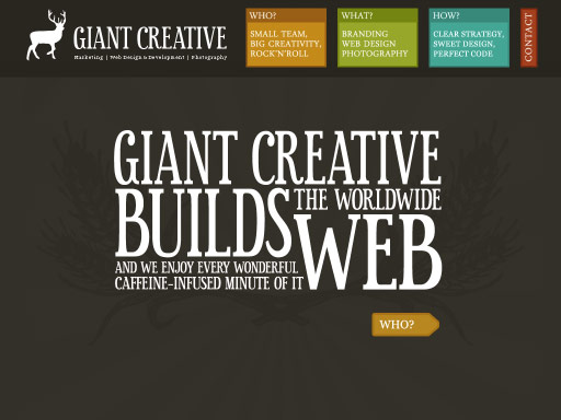
12. Giant Creative
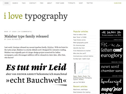
13. I Love Typography
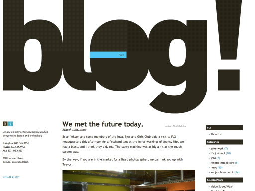
14. FL2
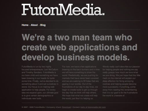
15. Futon Media
Further reading
Any good ones I missed?
Receive more design content like this to your inbox
I promise not to spam you. No more than one email per week.