If you develop web apps or design web app interfaces there is one link you will inevitably always have. This link allows the user to log in, or sign in, to the website. But what is the correct terminology to use?
A look at the big sites
Let’s look at the web’s top web sites and applications to see what terminology they use.
Login: 1 Sign in: 0
Gowalla
Login: 1 Sign in: 1
Foursquare

Login: 2 Sign in: 1
Basecamp
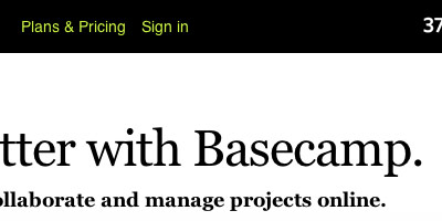
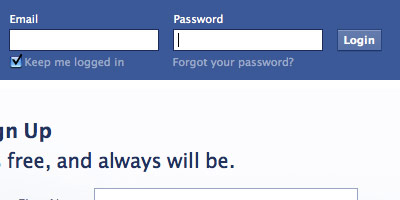
Login: 2 Sign in: 2
Login: 2 Sign in: 3
Login: 2 Sign in: 4
eBay
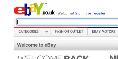
Login: 2 Sign in: 5
Login: 2 Sign in: 6
Last.fm
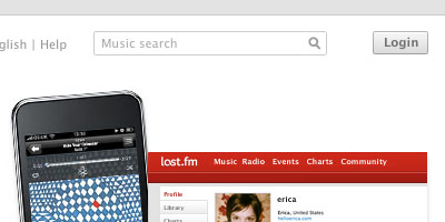
Login: 3 Sign in: 6
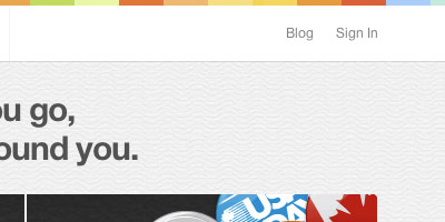
SlideShare

Login: 4 Sign in: 6
Vimeo

Login: 4 Sign in: 6 Log In: 1
Spotify
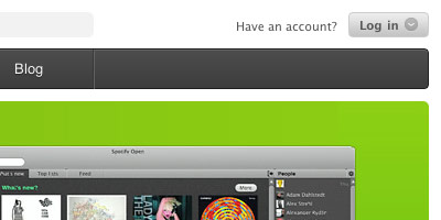
Login: 4 Sign in: 6 Log In: 2
Definitions
Looking at other websites there doesn’t seem to be anything decisive - there’s a mix of login, sign in and log in.
What does each term mean?
Definition of login (from Dictionary.com)
the act of logging in to a computer, esp. a multiuser computer or a remote or networked computer system
Definition of sign in (from Dictionary.com)
an act, an instance, or a time of signing in
No conclusive answer here either, both work fine.
How I work
I use login.
The reason for this is because I tend to keep sign up and login links available at all times, on all pages. These links are usually top right and next to each other e.g. Lookaly.com

Here’s a heatmap visual of this area.

Using the term ‘login’ means that at a glance the user can instantly tell the difference between ‘Login’ and ‘Sign up’.
By using ‘Sign in’ the user has to take a second or two to read the words to identify between the two and there’s more chance of them clicking the wrong link.
Of course this theory only comes into effect if you have a sign up and login link beside one another. As you can also see from the heatmap above, this sign up link doesn’t get a lot of clicks and most of the sign ups come from other call-to-actions throughout the site.
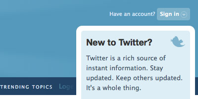
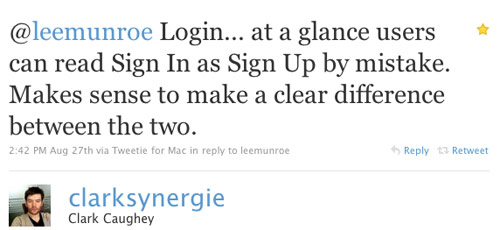
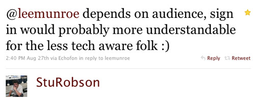
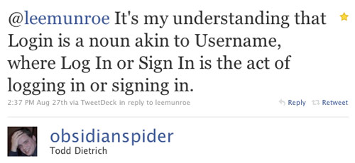
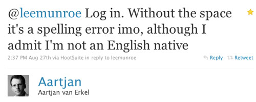
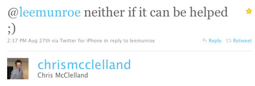
Words of wisdom from Twitter
I put the question out to my Twitter followers and got some good responses.

What do you think?
It’d be great to hear your verdict to see if you have a good reason to use one version over the other.
Use the poll below to cast your vote and please follow up with any comments or advice you have.
[polldaddy poll=”3764061”]
Receive more design content like this to your inbox
I promise not to spam you. No more than one email per week.