You can now produce stunning animations with CSS3. Did you know that? Of course you did.
CSS3 animations are the new kid on the block. It’s a big step. Although they haven’t really taken centre stage yet as only the webkit browsers support them.
For this reason they’re used sparingly, in a lot of cases for experimental purposes or as ‘hidden gems’, but that doesn’t mean you should shy away from getting stuck in.
It was only recently I experimented myself so I thought I’d share a beginner’s demo with you.
How to do CSS3 keyframe animations
Keyframe animations involve you setting the object state (or property) at different stages of an animation.
Setup the environment
Let’s setup a little demo. I’m going to start with two basic boxes.
<div class="box1"></div>
<div class="box2"></div>
Now apply some basic styling so we can see them.
.box1{
  width:200px;
  height:200px;
  background:rgba(255,0,0,0.5);
  position:absolute;
  top:100px;
  left:50%;
  margin-left:-100px;
}

.box2{
  width:200px;
  height:200px;
  background:rgba(0,0,255,0.5);
  position:absolute;
  top:100px;
  left:90%;
  margin-left:-100px;
}
And you’ve got yourself two boxes.

Setup the animation affect
Setup the animation affect and call it ‘movingbox’.
@-webkit-keyframes movingbox{
  0%{left:90%;}
  50%{left:10%;}
  100%{left:90%;}
}
movingbox is the name we’re giving the animation. It’s up to you what you want to call it.
The keyframes we’ve setup for this animation are at 0% (start), 50% (halfway through) and 100% (end). The properties we’ve set at these keyframes are different positions. You can set any properties you like here.
So far we still have two static boxes.

Apply the keyframe animation
Our last step applies the magic to the object of our choosing. We’re going to apply it to ‘box2’.
.box2{
  -webkit-animation:movingbox 5s infinite;
}
movingbox calls the animation we want to use, which we have already defined.
5s states we want the animation movement to last 5 seconds.
infinite means the animation will keep going and going.
We now have a CSS3 animation - box2 should be moving from right to left and back again. (Note: remember this only works in Safari and Chrome).

More CSS3 animation properties
This is a very simple example I have used here, and is just to help beginners get started.
For the -webkit-animation property, there are a number of other values you can try:
- -webkit-animation-name: [any name you like];
- -webkit-animation-iteration-count: [number, infinite];
- -webkit-animation-timing-function: [linear, ease,ease-in, ease-out];
- -webkit-animation-duration: [time];
- -webkit-animation-delay: [time];
For the @-webkit-keyframes rule, instead of using percentage as keyframes, we can also declare a from and to state. You can also make it transform while animating.
@-webkit-keyframes movingbox{
  from{left:90%;-webkit-transform: rotate(0deg);}
  to{left:10%;-webkit-transform: rotate(360deg);}
}CSS3 animations in action
See if you can spot the @keyframe animations on these sites (note: you’ll need to use a webkit browser like Safari or Chrome to see the animations in action).
Our Solar System
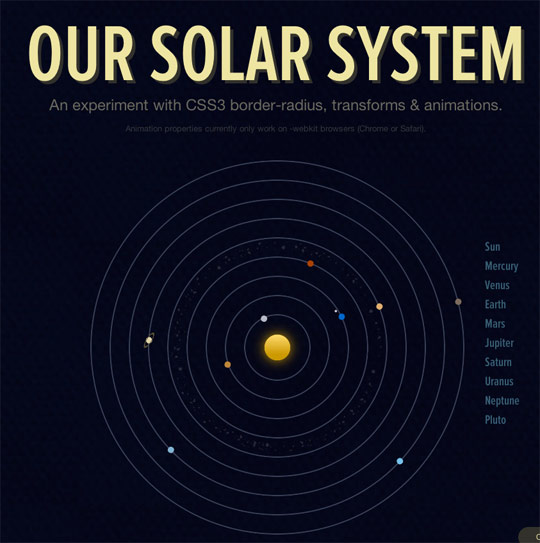
Our Solar System using pure CSS3 for planets and orbits.
Future Of Web Design

404 pages are always a nice place to experiment with stuff that only us geeks will get.
Hard Boiled Web Design

If the teaser site is anything to go by this book from Andy Clarke should be a good CSS3 reference.
Massive Blue

Sam Brown’s portfolio animation is subtle but beautifully executed.
Ecliptic

This was my experiment, a hidden ‘Easter egg’ on the Ecliptic website.
Conclusion
In regards to usefulness, the CSS3 animations above aren’t that. But they do let you, the designer, experiment with the latest techniques available.
Make a point of working a CSS3 animation into your next project just so you can get a feel for how they work. Then in the near future, when more browsers adopt them, you’ll be able to make some really attractive user interfaces without a gif or Javascript effect in sight.
Have you experimented with CSS3 animations yet?
Further reading
Receive more design content like this to your inbox
I promise not to spam you. No more than one email per week.