Last week I launched a holding page for Ecliptic Labs, an iPhone development company based in Belfast (keep an eye on them, there’s going to be some great stuff from them this year).
Here is the holding page in all it’s glory.
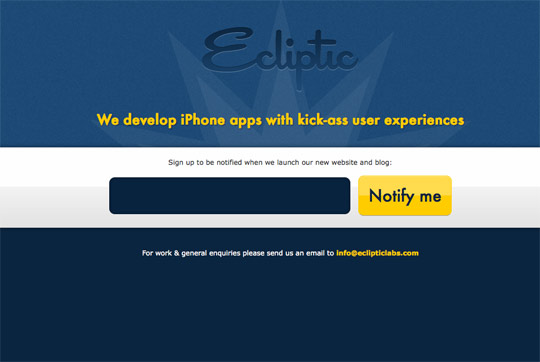
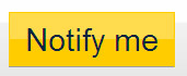
One thing you’ll notice is the big ‘Notify me’ button. One of the great things about this button is that it isn’t a graphic. It’s simply styled using CSS.
Advantages of using CSS instead of a graphic:
- Optimisation - less file size, less http requests
- Reusable - button can be used over and over again for different actions
- Flexible - the button can stretch or compact depending on length of the text
Styling the button element
I’m going to be using Firefox 3.6 for the previews below.
The markup
<button>Notify me</button>This is how the default button looks.

Basic styling
First apply some basic styling to get started.
button{
color:#08233e;
font:2.4em Futura, ‘Century Gothic’, AppleGothic, sans-serif;
padding:14px;
}
Nothing strange or startling about these styles. This is what we have now.

Background
Let’s add a background. Remember, we want to make the button reusable for any colour.
- Go into Photoshop and create a new image 10px x 100px
- Create a white rectangular shape that covers the top half of the canvas on a new layer
- Give that layer 30% opacity and make the background transparent
- Save that image as overlay.png
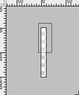
Decide what background colour you want to use and apply it to the button along with the overlay you just made.
background:url(overlay.png) repeat-x center #ffcc00;This gives us a nice yellow background with a glossy overlay.

Border
Now get rid of that horrible outset border. Let’s give it a fine border that matches the background colour.
border:1px solid #ffcc00;

Rounded corners
Make your button a bit friendlier by giving it rounded corners. This is where Webkit and Mozilla browser users will take advantage, while IE browsers will be stuck with sharp corners.
-moz-border-radius:10px;-webkit-border-radius:10px;border-radius:10px;
Starting to look good eh? But a good designer likes to pay attention to detail.
Pixel perfection
Now finish off the button with some pixel perfect embossing. We’re going to give it a 1 pixel border and a 1 pixel inset shadow.
border-bottom:1px solid #9f9f9f;
-moz-box-shadow:inset 0 1px 0 rgba(255,255,255,0.5);-webkit-box-shadow:inset 0 1px 0 rgba(255,255,255,0.5);box-shadow:inset 0 1px 0 rgba(255,255,255,0.5);
Notice how we’re using RGBA colours here. This allows us to apply alpha opacity to the colour. In this case, we’re giving white a 50% opacity.


Make it clickable
We know it’s a button and that it can be clicked but users might not. Change the cursor to a pointer so users know they can click it.
cursor:pointer;
Hover state
We now have a pretty sexy looking button. But what about a hover state?
To save us from thinking about a colour for the hover state, we can use the RGBA approach. Let’s revisit the background style. Add this after your background declaration.
background-color:rgba(255,204,0,1);Nothing changes. All we did was change it to the same colour but using RGBA.
But how for the button’s hover state, give it the same background colour but alter the opacity slightly.
button:hover{background-color:rgba(255,204,0,0.8);}This gives us a slightly different shade of background on hover, giving the user some feedback so they know they’ve hovered over a clickable button.
Put it all together
The final code.
button{
color:#08233e;
font:2.4em Futura, ‘Century Gothic’, AppleGothic, sans-serif;
padding:14px;
background:url(overlay.png) repeat-x center #ffcc00;background-color:rgba(255,204,0,1);
border:1px solid #ffcc00;
-moz-border-radius:10px;-webkit-border-radius:10px;border-radius:10px;
border-bottom:1px solid #9f9f9f;
-moz-box-shadow:inset 0 1px 0 rgba(255,255,255,0.5);-webkit-box-shadow:inset 0 1px 0 rgba(255,255,255,0.5);box-shadow:inset 0 1px 0 rgba(255,255,255,0.5);
cursor:pointer;
}

button:hover{background-color:rgba(255,204,0,0.8);}

button:active{position:relative;top:2px;}
I’ve slipped in an active state as well for the button so the user knows when they’ve clicked it.
This is how it looks in Firefox:

And this is an active preview.
Remember the button is reusable so if you apply a class to the button, e.g. class=”save”, you can apply a different colour to this button.
button.save{
background-color:#a7dd32;background-color:rgba(167,221,50,1);
border-color:#a7dd32;
}

button.save:hover{
background-color:rgba(167,221,50,0.8);
}
And you’d get something like this.

But what about Internet Explorer?
Yes, unfortunately IE users won’t get the full benefits of the sexy button. However, it doesn’t look that bad and to IE users it will seem like there is nothing wrong.
And IE6? It doesn’t support PNG transparency so you can remove the overlay background image with an IE6 conditional stylesheet.
<!--[if lt IE 7]>
<link rel="stylesheet" href="ie.css" type="text/css" />
<![endif]-->
Then in ie.css:
button{background-image:none !important;}And there you have it. A beautifully designed button using (pretty much) only CSS.

Further reading
I highly recommend you check out this great tutorial by Zurb on super awesome buttons with CSS3 and RGBA. A handy tutorial for styling reusable buttons.
Receive more design content like this to your inbox
I promise not to spam you. No more than one email per week.