Banking websites have to be the worst type of websites out there. People use them on a daily basis, many times a day, but yet they offer the worst user experiences.
I’ve had bank accounts with Alliance and Leicester, Ulster Bank, Bank of Ireland and the online banking experience has never been good.
However, I just checked out Bank of America and compared to the other banks I’ve tried it’s incredible.
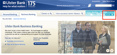
Ulster Bank business banking (Bankline)
Lets say I want to view a statement of recent transactions and see what my overall bank balance is. A very common task for online banking.
Click 1: Go to UlsterBank.co.uk and click business banking
Click 2: Click login
Opens a nice new window.
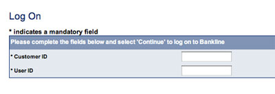
Click 3: Enter a customer ID and a user ID and click continue
Because one ID isn’t enough.
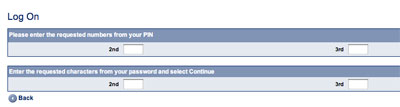
Click 4: Enter requested numbers from your PIN and requested characters from your password and click continue
There are so many IDs and passwords to remember that you have to write them down somewhere.
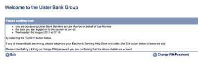
Click 5: Read the welcome message and click confirm
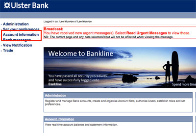
Click 6: Click account information
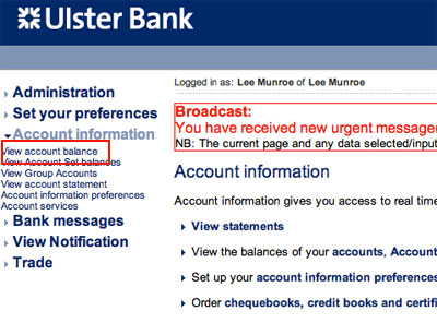
Click 7: Click view account balance
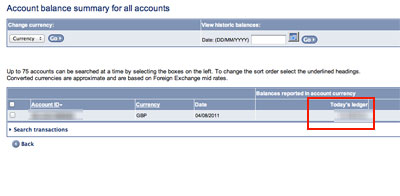
Click 8: Click on your account ID
Result number one. After 7 clicks I’m able to see my balance. Now I want to see a breakdown of recent transactions.
Statement
After 8 clicks, 2 IDs, 1 PIN and 1 password, I’m able to see my statement and my balance.
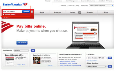
Bank of America
I’ve recently setup a US bank account with Bank of America. Here’s the user flow for wanting to view the same thing - my balance and recent statement.
Click 1: Enter my username and sign in
It actually remembered my username from last time.
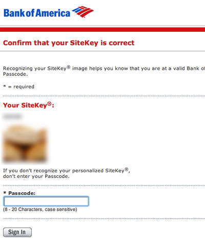
Click 2: Enter my passcode
Statement
The first screen I see after logging in is ‘Account Activity’. Immediately I’m able to see a balance summary and a statement of recent transactions. That’s only 2 clicks and one passcode I had to enter.
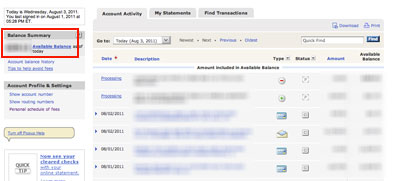
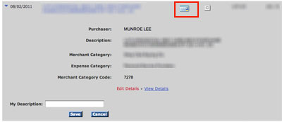
Not only do a get a good overview of my bank account straight away, each entry includes detailed information about the transaction, including icons to help me identify what type of transaction it was.
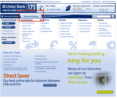
Ulster Bank personal banking (Anytime)
It took me 4 clicks, 1 customer number, 1 PIN and 1 password to see a brief statement and 6 clicks to see a full statement.
Bank of Ireland
I once had an account with Bank of Ireland but I left before I could get a chance to test their online banking.
According to them their online banking service was not compatible with Apple Mac at the time (this was about 2 years ago).
Alliance and Leicester (Santander)
Alliance and Leicester took 5 clicks, 1 customer ID and 1 PIN to view an overview and 6 clicks to see a full statement.
What's your experience like with online banking?
These are banking sites so obviously security is very important but does that mean the user experience has to be awful?
Until recently I assumed all online banking was terrible, but I’m very impressed with Bank of America.
Who do you bank with and how is their online banking? Why do banks not put more/any effort into UX?
Receive more design content like this to your inbox
I promise not to spam you. No more than one email per week.