What happens when you go on a ride at Disney Land? Apart from queuing for ages, you get onboard, enjoy the experience, get off and leave. But you don’t just leave. They have carefully designed a next step so that as you leave, you walk through the gift shop, subtly encouraging you to spend more money on merchandise and photos of yourself screaming.
The same principle can be applied to web design. Once you have your user committed, whether that be reading your blog post, signing up, making a purchase or making a contribution, design the next step so that the user flow doesn’t just come to a halt.
Blog
Someone has just read your blog post. Let’s assume it was a good post and they liked it. Rather than them leaving, satisfied with the knowledge you just provided, wouldn’t it be good if they would contribute or market your blog for you?
- Add share links to the bottom of your post and make it easy for users to share it across their social networks
- Ask a question that leads the user towards leaving a comment
- Suggest other posts that they might be interested in, and keep them on your site
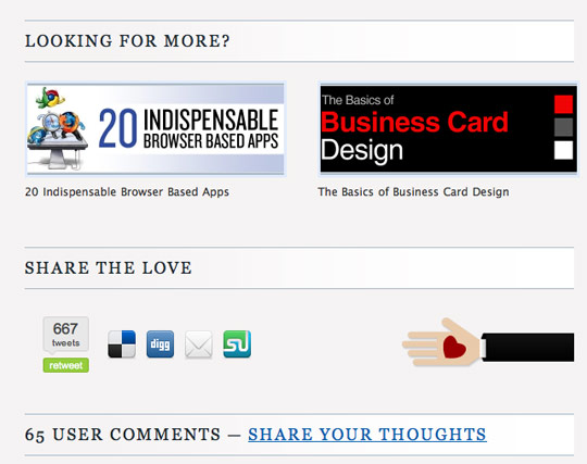
At the end of each post, Design Informer encourages users to share the love, share their thoughts and also suggests other posts they may be interested in
Sign up
When a user signs up you’ve got them on board. A quick easy sign up process is extremely important but once you have them in through the door, you can encourage next steps.
- Let them connect with their friends from other networks
- Make it obvious where to start
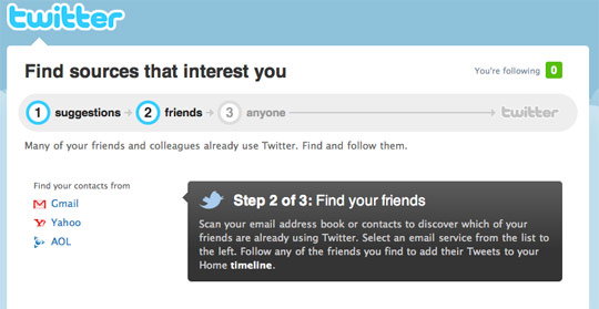
Twitter does a good job of encouraging you to invite and follow friends from your other networks.
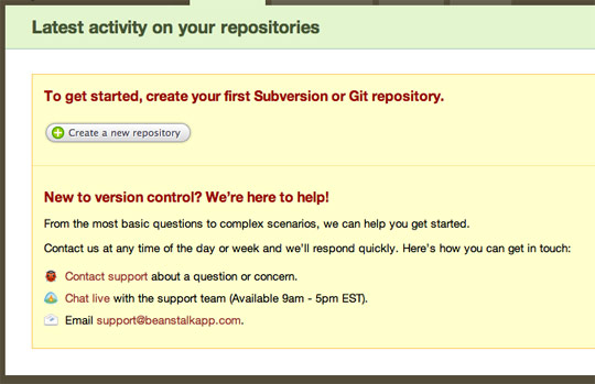
Beanstalk designs the blank state with an obvious ‘Create a new repository’ button and also provides some help for new users.
Contributions
When people contribute to your website, whether that be a status update, a review, a photo or even a blog comment, chances are they want to share that with their friends. After all, the reason they’ve contributed is so the rest of the world can see it.
By making it easy for users to share this link across their other social networks, they get to share it with their friends and it also helps get your own website or service out there.
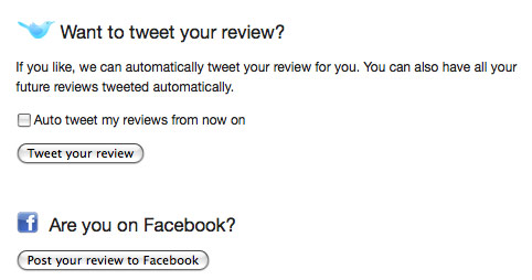
When someone writes a review on Lookaly, they can easily share this review with their friends on Twitter and Facebook with the click of a button.
Contact form
Your contact form confirmation is often something that is overlooked. Once you’ve confirmed to the user that their enquiry has been received, suggest other things they can do while they wait for their reply:
- Check out our blog
- Follow us on Twitter
- Make a donation
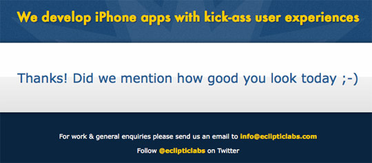
When you submit your email to Ecliptic’s website, you are presented with a compliment, along with links to their Twitter profile and direct email.
Checkout
If a user buys something from you, fantastic, you got the sale. But why leave it there? If they’ve departed with their money for something you are selling, chances are they’d do it again.

Amazon uses a smart shopping basket and checkout system that suggests related products during and after you have checked out.
Conclusion
The key is not to lead your users to a dead end - keep the flow going, always suggest more.
Getting them on board first is the hard part, but once you have them committed, it should be easier to lead them onto next steps.
Is this something you’ve thought about? Have you any other suggestions for designing next steps?
Receive more design content like this to your inbox
I promise not to spam you. No more than one email per week.