More and more businesses, web apps and designers are offering up multiple versions of their websites depending on the device and resolution the user is using. Last week I did a bit of tweaking to my own website and one of the things I wanted to look at was responsive design.
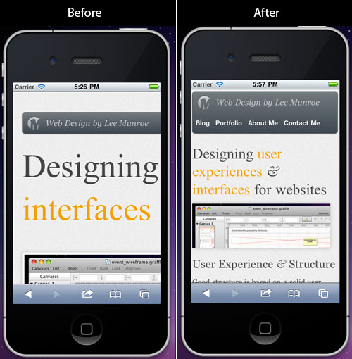
I simply wanted to offer an iPhone version of the website so iPhone users would see an iPhone friendly view of the website and blog articles, but using the same HTML/CSS and content (i.e. not serving up a separate mobile website).
It’s surprisingly simple.
What is responsive design?
Responsive design allows you to fill in the blanks within devices classes through the application of fluid grids, flexible images, and (where possible) media queries.
As Luke outlines above, it’s about using up the space that is available, on the device the user is using, most effectively.
So a user using an iPad may be served a different view of the website as to that of a user using an iPhone (or desktop, or netbook or some super duper Nasa sized resolution).
Using CSS media queries
With a CSS media query we can target different screen resolutions with different styles.
Place this in your CSS stylesheet:
@media only screen and (max-width: 480px) {
	/* Mobile styles go here */
	body{width:100%;}
	img{max-width:100%;}
}
The styles above are just examples. Remember to enter your own CSS.
Then place this in your HTML header to ensure the iPhone doesn’t automatically scale down the full page:
Simples.
Things I changed for iPhone/smartphone view:
- Max-width of the overall container
- Made the grid 1 column
- Adjusted the font size for headings
- Adjusted navigation positioning
- Gave images a max-width
- Hid a couple of things that weren't important
And the result:
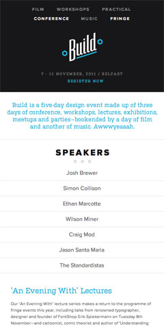
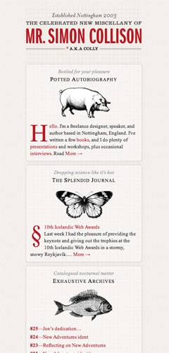
Examples of responsive designs in use
Build
Simon Collison
Lanyrd

UX London

Today, anything that’s fixed and unresponsive isn’t web design, it’s something else. If you don’t embrace the inherent fluidity of the web, you’re not a web designer, you’re something else.
Web design is responsive design, Responsive Web Design is web design, done right.
Have you made any of your sites responsive?
Let us know below so we can check them out.
Further reading
- Responsive Web Design by Ethan Marcotte
- Media Queries - showcase of responsive websites
- Guidelines for Responsive Design
Receive more design content like this to your inbox
I promise not to spam you. No more than one email per week.