I often browse a handful of CSS galleries for continuous inspiration but it’s good to draw inspiration from a host of other sources, one of those being packaging.
Creative packaging shows a good reflection on the brand it represents. My first real appreciation of packaging was opening my first Apple product, which was an iPod Touch. The perfectly crafted box and minimalism is reflected throughout the Apple brand, including their website. Some even go as far as to film themselves unboxing Apple products as it is such an enjoyable experience.
Drawing inspiration from packaging design can inspire new ideas and different approaches for your next project. Check out these great examples.
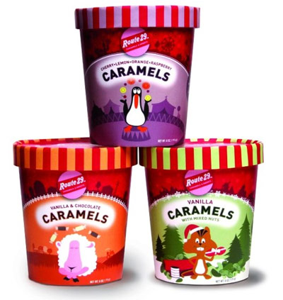
Route 29
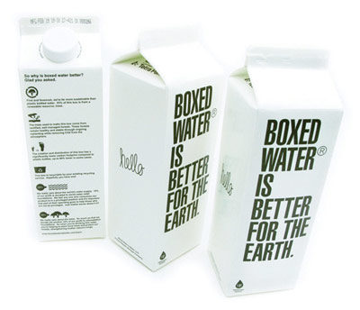
Boxed Water
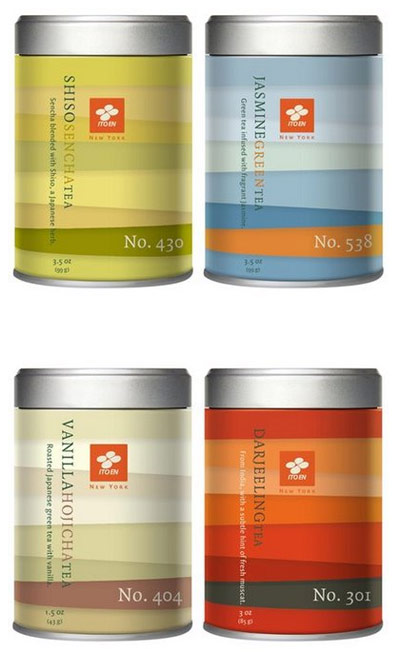
ITO EN Loose Leaf Tea
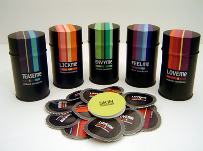
Skin
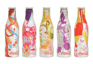
Coca Cola
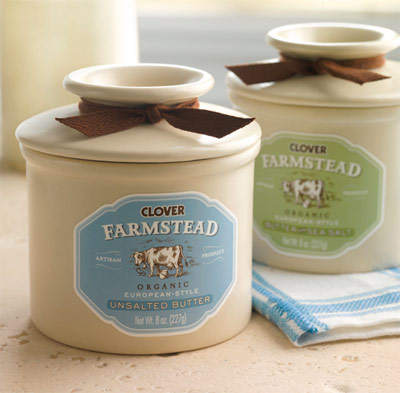
Clover Farmstead Butter
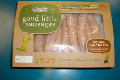
Good Little Sausages
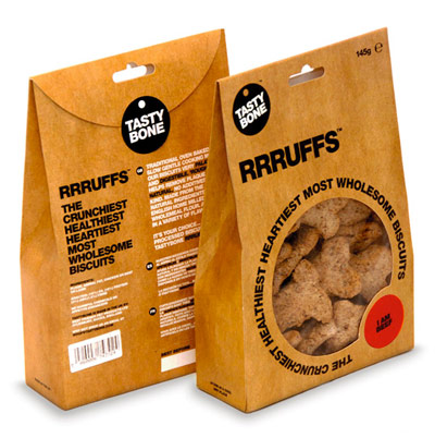
Tasty Bone
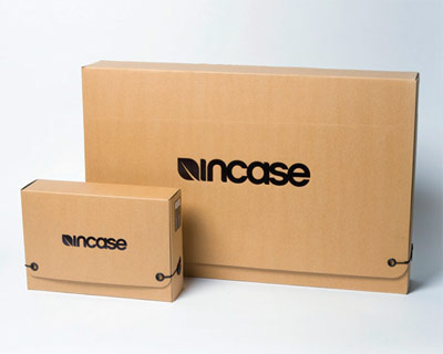
Incase
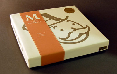
Monopoly
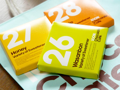
100% Chocoloate Cafe
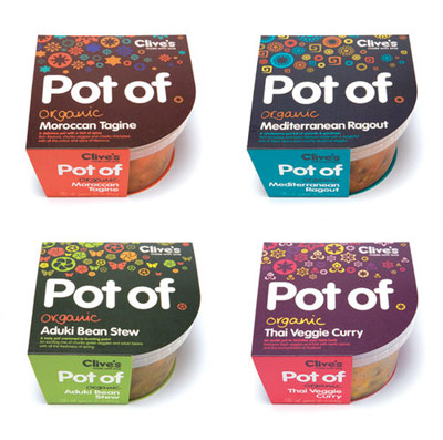
Pot Of
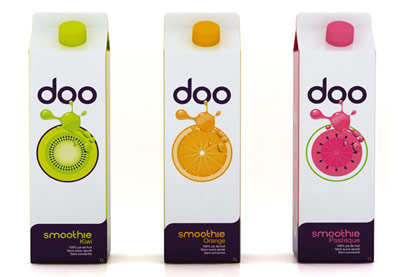
Doo
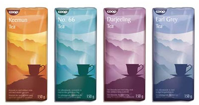
Coop Norden
Other sources of packaging inspiration
- Beautiful and expressive packaging design
- Packaging design inspiration
- Creative coffee packaging
- 100 minimal and typographic package designs
- Lovely package
Further reading
Is there any packaging in particular that you find inspiring?
Receive more design content like this to your inbox
I promise not to spam you. No more than one email per week.