5 Tips for Designing iPhone Apps in Photoshop

Designing a user interface for iPhone is totally different than designing for the web. Small screen, fixed width, users are on the move etc.

I’ve been designing a couple of iPhone apps recently and while doing so came across some useful techniques that I thought I would share for any designers who have still to move from web to iOS design. Good luck designing your mobile apps for iPhone!

1. Setup Photoshop

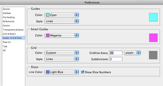
If you’re designing for iPhone 4 you’re designing for a high-res retina screen. 2 pixel lines appear as 1 point when they’re shown on screen.

Setup your Photoshop grid so the minimum grid lines are split in 2 pixels.

Photoshop > Preferences > Guides, Grid & Slices

I set the gridline to every 20 pixels, and subdivisions to every 2 pixels.

grid.png

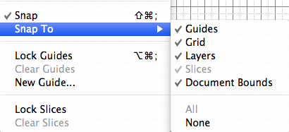
Now ensure you have snap setup to snap to all, ensuring any objects you move will snap to the 2px grid.

snap.gif

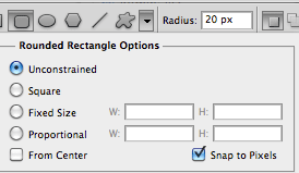
Also ensure your shapes tool is setup to snap to pixels. This should keep everything nice and sharp.

snapshapes.gif

Colours look different on different screens so you may want to adjust your colour settings also.

There’s a good article by bjango on how to setup colour preferences for iPhone in Photoshop.

2. Have a PSD template

If you’re a web designer you more than likely have a PSD template for designing a web site in Photoshop or a framework for marking it up in HTML/CSS.

Do the same for designing an iPhone app. Have the ‘static’ elements in place (e.g. status bar), a grid to work to and typical guide lines you might want to use (e.g. a guide line for the tab bar).

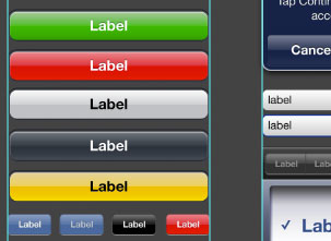
You may even want to have several elements to hand like buttons, text etc.

psd.gif

3. Download the iPhone 4 GUI PSD retina display

Save yourself some time and effort by using Teehan+Lax’s iPhone 4 GUI PSD retina display elements.

Even if you’re designing your own style of buttons, tab bars etc. these will come in very handy.

gui.jpg

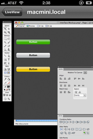
4. Use Liveview to preview your user interface

It’s impossible to get a good idea of how an iPhone interface will actually look on an iPhone when you’re designing on a monitor.

Thanks to Nicholas Zambetti, there’s a free app to help you live preview your UI on iPhone.

  1. Window > Arrange > New window for [documentName]
  2. Move the new window to part of the screen you’re not using (a separate monitor works best)
  3. Open Liveview and place the ‘frame’ over that window in Photoshop.
  4. Now open Liveview on your iPhone, connect to your computer, and voila there is your app on your iPhone, giving you a live preview of how it looks.
liveview.gif

5. Know the Apple iOS Human Interface Guidelines and best practices

Apple have documentation on designing interfaces for iOS that you must read if you’re designing any iOS app.

There are a lot of enforced guidelines in here along with best practices for mobile devices.

Examples:

Have you any tips for designing iPhone apps?

I’m sure there are a lot of seasoned designers out there who can share many more tips than me so please leave them in the comments below.

What are your experiences and have you any techniques you’d like to share?

Further reading

Related articles


23 Appreciated Comments

  1. On the , Chanelle Henry said:

    Really love these tips. I know the one thing I use a lot is LiveView. Ever since it came out I’ve been such an avid fan of the program because it helps you as well as your clients see it in “semi-realtime” rather than email yourself, navigating to photos…etc… It’s a beautiful app!

    I know I definitely learned something with #1, there is one setup I fail to do to help make the rest of the process easier. Really good tips!

    Something else that I do is also have some icons nearby for elements that the mockup psd file doesn’t necessarily have like Smashing Mag’s resources of icons that can be downloaded for products. They definitely help and make a design look great.

    I digress… Great post!!

  2. On the , tvdvdset said:

    I’ve been surfing online more than 3 hours today, yet I never found any interesting article like yours. It is pretty worth enough for me. Personally, if all website owners and bloggers made good content as you did, the net will be a lot more useful than ever before.

  3. On the , Stephen said:

    Thanks Lee, great insight to the way you work much appriciated.

  4. On the , Josh said:

    Great article, Lee. Can you offer a few more details on why it’s important to set your gridlines to those parameters? If I don’t use those settings, is it really noticeable in my app design?

    LiveView sounds really neat. But, is it available for PC? I didn’t see a PC download.

  5. On the , Lee said:

    @Josh: I don’t think the actual figure is that important, as long as they are even numbers. If you’re designing for the iPhone retina screen, and your graphic happens to lie on an odd pixel then you will experience a slight blur when viewed on the iPhone screen so you lose that crisp pixel perfect graphic. It’s also nice if they divide equally into 960×640. Doesn’t look like Liveview is available for PC I’m afraid.

  6. On the , Jake Rocheleau said:

    Great beginners tut into iOS design. love the step-by-step process and I’ve sure learned a lot of techniques

  7. On the , Aero Designs said:

    I’ve come across PhoneGap .com recently which seems a great tool for developers that are more used to web dev rather than app development. I’ve not had chance to try the service yet but from what I gather it takes a HTML5/CSS/JS ‘app’ and builds it into downloadable apps for the major smartphones.

    Thanks for the retina display element link, they’ll come in handy!

  8. On the , Waco Webdesign said:

    I love this great articles. I’m getting into the mobile apps more and more.

  9. On the , Rafael John said:

    wow thanks a lot lee, i have also read on other articles that it is also ok to start in the iPhone size *even at 72 ppi* as long as I mostly use shape layers and layers style + enabling scale styles so when I upsize its still detailed, however I assume that when I make the design in iphone 3 res my subdivisions for the grid would be 1 right? also about the “gridline every: X pixels” do I have to place 20 or is it just your preference? ^^
    and you I see you have a cool psd grid template can I also get one of those resource? I actually have made an action to prepare an iPhone 3 template with guides but the guides are only for the status bar and title bar.hehe. hope to hear from you

  10. On the , Rafael John said:

    hi again, is it possible that I can have the psd for your iphone grid template?

    Cheers!

  11. On the , Barry Flood said:

    Lee, you know of any good tutorials for developing iPhone apps?

  12. On the , Jeff said:

    Great tips ! Thanxx a lot Lee !

  13. On the , David said:

    Clear and practical. Thanks!

  14. On the , iPhone Developer London said:

    Thanx Lee… This really helped a lot…

  15. On the , App Developers said:

    I already knew how to design apps on Photoshop but never like this, this technique is more easy than what I use. Thanks buddy.

  16. On the , Ayyan Roy said:

    Great work, it’s very helpful. Thanks ^_^

  17. On the , mahalie said:

    This is great, I’ve found LiveView invaluable.

    I’ve been reading the Apple iOS HIG and searching online quite a bit looking for an article on prepping files for the developer. Specifically the Task Bar custom selection indicator image and buttons parts. Seems like you’re designing/exporting buttons like one would do rounded corners back in the days of table-based web design (9 grid).

    Have never done assets for app (vs. web) and would really like some tips on this!

  18. On the , Go Inspired said:

    Cool tutorial! Thanks for sharing!

  19. On the , Nathan Walker said:

    Nice. One thing I would say is that if you’re working with Photoshop CS5, you might want to take a look at Bjango’s Skala family of apps instead of LiveView. I’ve worked with both, and Skala works far better. It’ll cost you a few dollars but it allows you to work in more accurate real time to multiple devices. Other then that, it seems you and me think on exactly the same wavelength when it comes to working for iPhone.

  20. On the , Lenny said:

    Thanks for these great tips, sometimes these can seem common sense but yet many designers (guilty!) don’t use these simple guidelines. I’m changing my preferences now! Do you have a twitter handle where you post these kind of tips? If so @Lennymonk would love to follow!

  21. On the , Tristan said:

    Thanks for your tips. Cool article.

  22. On the , Steffen Daleng said:

    Great work Lee. Thanks for the addition

  23. On the , darko said:

    GUIDLINE EVERY 20PX
    SUBDIVISION 10 X, not 2x (subdivision divide that 20 px)

    when you divide those 20px to 10 lines you got every 2px one line.

    cheers

Have a comment? Tweet @leemunroe and I'll be glad to respond.