I’m working on a project that requires a bit of Javascript loading time before displaying the UI, so instead of doing what I usually do and downloading an animated gif from ajaxload I thought it would be a good opportunity to try out a CSS3 animation.
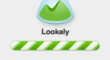
Inspired by 37 Signals loading bar (pictured above) and making good use of Chris Coyier’s tutorial on CSS3 Progress Bars I set to work designing a bar in Photoshop and then replicating it in CSS3.

CSS and Markup
Here is the source code if you want to try it yourself.
<style>
/*
Set the container for the bar
*/
.bar {
	height:20px;
	width:200px;
	padding:10px;
	margin:200px auto 0;
	background-color:rgba(0,0,0,.1);
	-webkit-border-radius:25px;
	-moz-border-radius:25px;
	-ms-border-radius:25px;
	border-radius:20px;
	-webkit-box-shadow:0 1px 0 rgba(255,255,255,.03),inset 0 1px 0 rgba(0,0,0,.1);
	-moz-box-shadow:0 1px 0 rgba(255,255,255,.03),inset 0 1px 0 rgba(0,0,0,.1);
	-ms-box-shadow:0 1px 0 rgba(255,255,255,.03),inset 0 1px 0 rgba(0,0,0,.1);
	box-shadow:0 1px 0 rgba(255,255,255,.03),inset 0 1px 0 rgba(0,0,0,.1);
}

/*
This is the actual bar with stripes
*/
.bar span {
	display:inline-block;
	height:100%;
	width:100%;
	border:1px solid #ff9a1a;
	border-bottom-color:#ff6201;
	background-color:#d3d3d3;
	-webkit-border-radius:20px;
	-moz-border-radius:20px;
	-ms-border-radius:20px;
	border-radius:20px;
	-webkit-box-sizing:border-box;
	-moz-box-sizing:border-box;
	-ms-box-sizing:border-box;
	box-sizing:border-box;
	background-image:
		-webkit-linear-gradient(
		-45deg,
		rgba(255, 154, 26, 1) 25%,
		transparent 25%,
		transparent 50%,
		rgba(255, 154, 26, 1) 50%,
		rgba(255, 154, 26, 1) 75%,
		transparent 75%,
		transparent
	);
	background-image:
		-moz-linear-gradient(
		-45deg,
		rgba(255, 154, 26, 1) 25%,
		transparent 25%,
		transparent 50%,
		rgba(255, 154, 26, 1) 50%,
		rgba(255, 154, 26, 1) 75%,
		transparent 75%,
		transparent
	);
	background-image:
		-ms-linear-gradient(
		-45deg,
		rgba(255, 154, 26, 1) 25%,
		transparent 25%,
		transparent 50%,
		rgba(255, 154, 26, 1) 50%,
		rgba(255, 154, 26, 1) 75%,
		transparent 75%,
		transparent
	);
	background-image:
		linear-gradient(
		-45deg,
		rgba(255, 154, 26, 1) 25%,
		transparent 25%,
		transparent 50%,
		rgba(255, 154, 26, 1) 50%,
		rgba(255, 154, 26, 1) 75%,
		transparent 75%,
		transparent
	);
	-webkit-background-size:50px 50px;
	-moz-background-size:50px 50px;
	-ms-background-size:50px 50px;
	background-size:50px 50px;
	-webkit-animation:move 2s linear infinite;
	-moz-animation:move 2s linear infinite;
	-ms-animation:move 2s linear infinite;
	animation:move 2s linear infinite;
	-webkit-border-radius:20px;
	-moz-border-radius:20px;
	-ms-border-radius:20px;
	border-radius:20px;
	overflow: hidden;
	-webkit-box-shadow:inset 0 10px 0 rgba(255,255,255,.2);
	-moz-box-shadow:inset 0 10px 0 rgba(255,255,255,.2);
	-ms-box-shadow:inset 0 10px 0 rgba(255,255,255,.2);
	box-shadow:inset 0 10px 0 rgba(255,255,255,.2);
}

/*
Animate the stripes
*/
@-webkit-keyframes move{
  0% {
  	background-position: 0 0;
  }
  100% {
  	background-position: 50px 50px;
  }
}
@-moz-keyframes move{
  0% {
  	background-position: 0 0;
  }
  100% {
  	background-position: 50px 50px;
  }
}
@-ms-keyframes move{
  0% {
  	background-position: 0 0;
  }
  100% {
  	background-position: 50px 50px;
  }
}
@keyframes move{
  0% {
  	background-position: 0 0;
  }
  100% {
  	background-position: 50px 50px;
  }
}
</style>

<!-- Start of loading bar -->
<div class="bar">
	<span></span>
</div>
<!-- End of loading bar -->If you like it please give it some love on Dribbble.
Receive more design content like this to your inbox
I promise not to spam you. No more than one email per week.