This is something I’m curious about and something I’d like to get your feedback on. Do you need to confirm passwords on sign up?
It’s an extra field
For me, I don’t think you do need to confirm your password. It’s an extra field to fill in therefore it takes extra time to complete sign up, so the more fields there are to complete the more I’ll think twice about signing up.
But what if I misspell my password?
A password field will be starred out i.e. you don’t see what you’re typing, which means you could easily make a mistake and submit the wrong password without knowing.
This is where the ‘Forget your password‘ function comes in handy, which is an inconvenience but will have you up and running again with your old/new password in a couple of minutes.
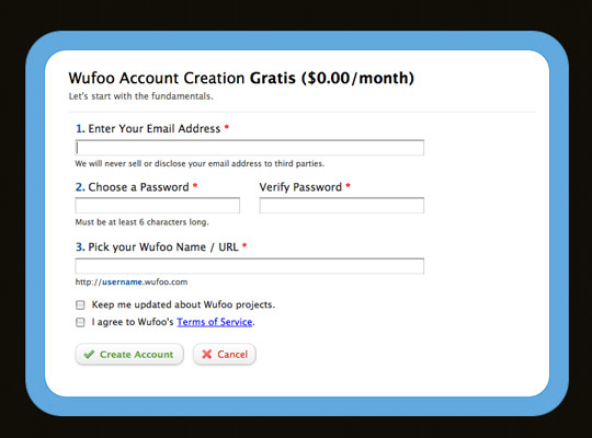
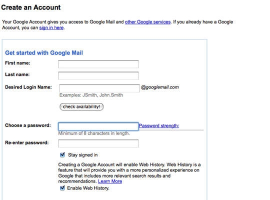
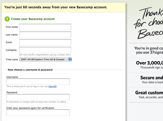
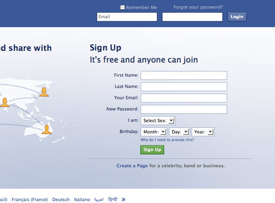
Sign up forms with confirm password
WuFoo
GMail
Basecamp
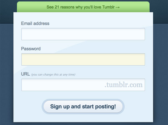
Sign up forms without confirm password
Tumblr
What you think on Twitter
What’s everyones thoughts on confirm/verify password fields on sign up. Are they necessary?
I’d say if you have a FOOLPROOF password reset mechanism it’s ok, but remember users are always the weak link.
Annoying and not needed if there’s decent ‘forgot your password’ functionality later in the game.
yes! either that or do what neilsen suggests and make password fields plain text…
![]()
Confirm/Verify just a nuisance to me, I use 1Password or Textexpander to fill that in, so it just makes me paste twice
They are useful, but not necessary, somehow it looks unfriendly, like mistrusting the user.
Unnecessary. The iphone Password system is good. You see the char you typed for 1 sec then it disappears
I despise them. Just make sure they have a means of getting back in if they do manage to mess it up
![]()
They don’t bother me so much, handy for the odd times when a typo is entered into a password field during a rushed sign-up.
Yes. A large portion of support calls to clients regarding log in issues were reduced when we introduced a p/word confirm field.
i would think so, just incase you mistype it =)
To confirm or not to confirm?
What is the best route to take if designing/developing a sign up form? Have an extra field to verify the password or forget about the extra field and assume if the user makes a mistake they can use the forgotten password link? Or is there something else about the confirm password field that I’m overlooking here?
Let me know what you think as a user and your reasoning behind your preference.


September 7th, 2009
Joe Scanlon says:
I’m struggling with the same question at the moment for littleQuiz.com. I think I’ll leave in two fields for now, and test how it goes when I later remove the verify field. I know Facebook has been doing something similar, they defo had a verify field in their signup a few months back.
September 7th, 2009
Stuart Gibson says:
You could go the route of that other age-old question, do you need to star out the password in anything but the most security dependent applications?
The chances of anyone looking over your shoulder when signing up for Twitter or similar are so low, you could probably greatly reduce the mistyped password issue by letting the user see it as they enter it. Let the user visually confirm they have entered the correct password rather than machine verifying it.
In the case of banks etc, I think the double password is a good thing as the potential issues of being locked out of your bank website is a lot more than those of being locked out of Twitter.
September 7th, 2009
Mark McCorkell says:
Definitely not needed, and the chances are if you couldn’t spell it correctly a few seconds before in the first field you won’t spell it correct in the second.
The thing is though… if you removed now at this stage, after people have got used to it, then you may get some “password paranoia” when they’re signing up. So in that sense some may argue that it is good to give users peace of mind about the password they entered.
September 7th, 2009
Sean Delaney says:
I think a confirm password field on signup pages are important.
I was developed an recruitment website a few years ago where I also provided technical support for 6 months after the project went live. During that time we had alot of the job seekers failing to login to their account as they would enter the password after registering. This also resulted in a large number of duplicate accounts been created!
However after we included a confirm password field, we saw a decrease in the number of first time login failures….
September 7th, 2009
Alan Anderson says:
Part of any design process it to ensure the user has a positive experience when visiting your site so by adding a confirmation it reduces the issue of mistyping and when they return they have to trial and error their password until they get it right or reset their password again if they can not remember it, which can put the user from using the site or service again (in the worst case)
But the other part of the design process is to reduce the customers workload with non sale enquiries which distract the owner from making money, the reason the site is there for in the first place.
Now this is not to say joe bloggs will not forget their password, but if there is a way to reduce this from happening, it should be implemented, in my opinion anyway!
Nice article.
September 7th, 2009
Techboy says:
I prefer not to have a password field at all. How? Simple – use OpenID.
However if a password field is required, I think 2 are required. As other people have posted here, it is common for users to mis-type it and then raise a support call about it (instead of using the ‘retrieve password via e-mail option).
On http://www.stackoverflow.com, all registered users are required to have an OpenID account. On http://www.getmecooking.com we have provided both options (OpenID plus standard username and password). On GetMeCooking I would prefer all users to log on with an OpenID account, however because it has a wide, non-technical audience, we know that some people might not have an OpenID account.
September 7th, 2009
Lee says:
Good to see some discussion with this and how your personal experiences have impacted on your thoughts.
@Stuart: Good point on banks – yes, definitely for them as it is such a secure system and it’s a bollocks getting locked out. Don’t know about the no starring out of passwords – risky.
@Sean: Good to see some ‘proof’ of it’s usage
@Techboy: OpenID is certainly useful for ‘techies’ and I like the idea of having both options.
Is it common for users to contact help rather than clicking the forgotten password link themselves?
September 7th, 2009
Techboy says:
@Lee – OpenID isn’t just for techies. e.g. all users who have a facebook account have an OpenID account as facebook is an OpenID provider.
Many sites (including GetMeCooking) have been set up to be an OpenID consumer, so users can log on with a facebook, Yahoo, AOL, Google, etc. accounts.
September 7th, 2009
Techboy says:
> Is it common for users to contact help rather than clicking the forgotten password link themselves?
A small percentage of users will always prefer to pick up the phone or e-mail the helpdesk instead of tackle problems themselves. I think this is more evident in an office environment – on the Internet users will just give up or find another similar website.
September 7th, 2009
Brian Kissel says:
Try OpenID, Facebook Connect, Windows LiveID, MySpaceID, Twitter or other single signon (SSO) solutions. If your website accepts these forms of registration and login, your customers only need to click a button, no user name and password to remember. An easy and free solution for this is JanRain’s RPX, http://rpxnow.com which is deployed on thousands of websites.
September 7th, 2009
David Lowry says:
A comment re: “unstarred password fields”
Security nightmare! There’s no form of encoding there at all, the values can be retrieved from the browser history. I’d suggest trying that would lose you users OR make users use less secure, less private passwords leaving your site more vulnerable to attack.
September 8th, 2009
Michael Kozakewich says:
I wonder if it would be usable to say “field not required” beside the extra password field, and only check the two together if the second one isn’t blank. This way, the user can fill it in if they want the added fail-safe, but they don’t need to if it’s a bother.
September 8th, 2009
Dave Sparks says:
I think it’s optional but if you don’t have a confirm password field then you surely must have a confirm email field. That way if your user messes up the password a forgot password link will sort it out and you can guarantee their clumsy fingers put the email address in correctly.
September 8th, 2009
Mark McCorkell says:
For me, the real pain in the ass is the visual confirmations that are so obscure they are actually illegible. On google some of their visual confirmations are really hard to read and when you click on the audio is sounds like someone talking on tongues! A bit off topic but thought I needed a rant!
September 8th, 2009
Sean says:
Just to be clear, you are suggesting replacing a field that takes 5 seconds tops to fill out with the “remember your password” link, which users 1. have to find, 2. have to fill out, and 3. have to wait for the email? How exactly is that faster?
Yes, for the technically savvy, that 5 seconds of repeating a password which you probably can enter blindfolded with both hands tied behind your back may be a nuisance.
But for those who are not you, the confirm password field helps ensure that your users are not making a critical mistake that will immediately prevent them from using your website.
So, 5 seconds of extra typing, or users leaving your website because they cannot get signed in…which is the better end result?
September 8th, 2009
Arie Putranto says:
Well, I think it wasted my time. To be careful not to mistype when submitting a password is way more reasonable than to submit it twice! You’d think …
September 9th, 2009
Charles Boyung says:
Re: David Lowry
Do you think there is some sort of form encoding with a password input form element? As far as the HTTP request being sent, the password and text input types are absolutely identical. Also, as for the browser remembering entered passwords, there are HTML 5 attributes that prevent autocomplete from working that all browsers with that functionality from saving that value. No security hole there either.
That said, even though Jakob Nielsen has suggested it as the best practice to move towards (and I agree completely), there is the user trust factor to take into account. This is why when I convince my clients to go this route, part of the design includes a small link next to the password textbox that states something along the lines of “why is my password shown in plain text?” which pops up a small inline box explaining why it is this way and how there is no security problem while doing so. It is also important to follow Nielsen’s recommendation completely here, which is to include a checkbox to “hide my typing”, which converts the characters to the discs (or anything else, really). With this mechanism, you can even easily do what someone above suggested, which is to mimic what the iPhone does.
September 16th, 2009
Lee says:
Thanks for all the comments. It’s hard to come to a conclusion on this.
Seems that yes, the confirm password field is annoying and not so important for ‘tech savvy’ users (which probably includes everyone that commented). On the other hand, for the non-tech savvy users it gives them assurance and also cuts down mistakes, based on several of your experiences.
Does it depend on your target market then? Let’s say a web app aimed at ‘techies’ or as Sean mentioned those with passwords who ‘can enter blindfolded with both hands tied behind your back’ could do without confirmation but more general apps towards all users should have confirm passwords?
Open ID and other SSO solutions are getting more popular and are potentially the best solution going forward, skipping sign up completely.
December 24th, 2009
joe gannon says:
I dont see the big deal in asking the user to confirm it. It ensures the user’s password created is correct. Tech savvy and less experienced users can both make mistakes. I think the bigger issue is with password creation. Most sites do a terrible job in educating the user into creating effective passwords that are strong yet easy to remember. Rules such as requiring 6 characters, with letters and numbers are not the best way to create a strong password.