Call to action buttons are the buttons that you, as a web designer, want all your users to click on when they land on your page. Usually they’ll be a link to a download, signup or sale.
Seth Godin (The Big Red Fez) calls them bananas and your users are the monkeys. The objective is for the monkey to find the banana in less than 3 seconds (before they give up and leave). “Force yourself to design each and every page with one and only one primary objective. That’s the banana. Make it big. Make it blue (or red). Make it obvious.”

This post discusses how to design the perfect ‘call to action’ button and showcases 30 examples of good call to action button designs.
How to design the perfect call to action button
Force yourself to design each and every page with one and only one primary objective.
Your call to action button needs to be obvious and jump out at the user. Here’s 5 characteristics of a good call to action button.
1. Colour
The colour should stand out from the rest of the page, and is therefore usually a brighter, contrasting colour.

2. Location
It should be located where the user would expect to find it easily. Above the fold, beside a product, in the header, top right navigation; it should be obvious and not hard to find.

3. Language
The language you use to communicate with your user is important. It should be short, to the point (no waffling) and should start with an action verb like signup, download, create, try etc.
And give the user a reason to click on your call to action button, ‘free’ being the number one incentive.

4. Size matters
To make it obvious that it’s your most important button and that you want users to click on it, make it bigger than any other button and give the user as much area as possible to click on.
5. Room to breathe
Your button shouldn’t be overcrowded with other elements. It needs sufficient margins so it can be distinguished and the text needs enough padding so it’s easy to read.

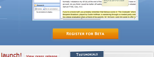
Showcase of good examples of call to action buttons
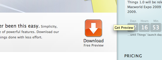
1. Things
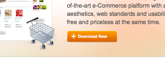
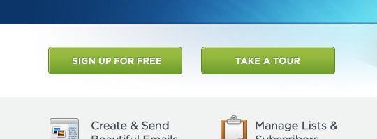
2. Wordpress e-Commerce
3. Skype

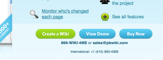
4. PB Wiki
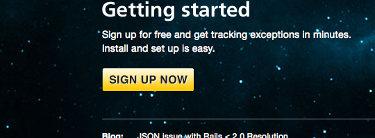
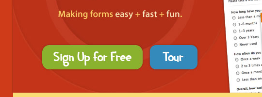
5. Exceptional
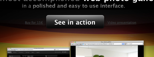
6. PicsEngine
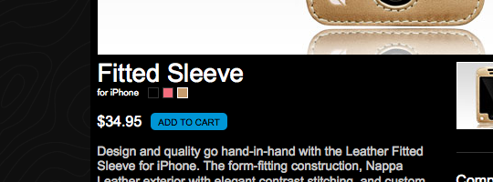
7. InCase
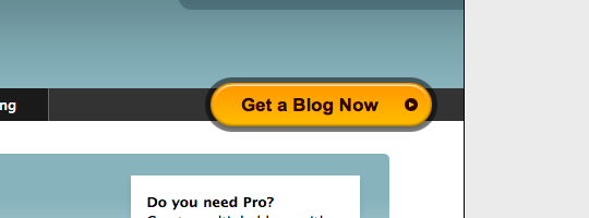
8. GoodBarry
9. Plan HQ

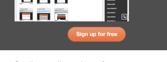
10. TypePad
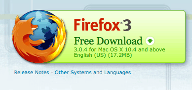
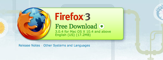
11. Mozilla Firefox
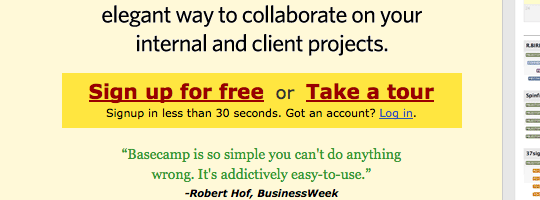
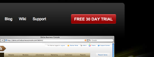
12. 37 Signals
13. Hambo Design
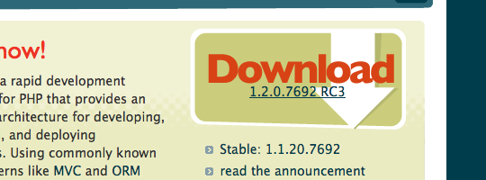
14. Cake PHP
15. Traffik
16. Boag World
17. Donor Tools

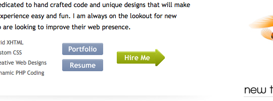
18. Luke Larsen
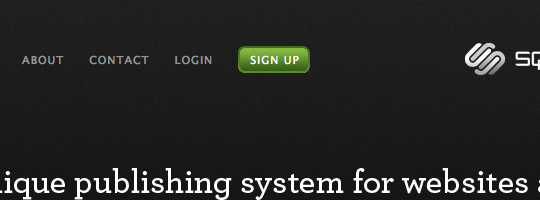
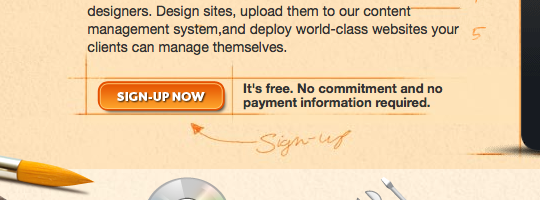
19. Square Space
20. Wu Foo
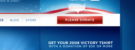
21. Barack Obama
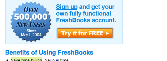
22. Freshbooks
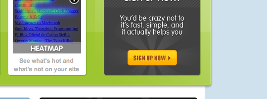
23. Crazy Egg
24. Web Notes
25. Campaign Monitor
26. Light CMS
27. Litmus
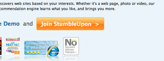
28. Stumble Upon
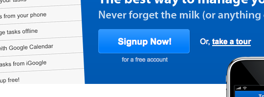
29. Remember The Milk
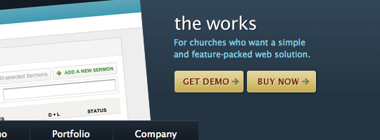
30. Ekklesia 360
Further reading
- The Big Red Fez Easy read by Seth Godin on how to make your website better
Any other pointers you like to offer or any other good examples you know off, please share them in the comments below.
Sponsored link: Excellent printing brochures available at PsPrint.
Receive more design content like this to your inbox
I promise not to spam you. No more than one email per week.