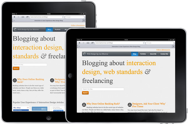
Back in April I wrote a post about experimenting with responsive web design, and how my website responded, or adapted, to different devices and browser widths.
After reading Ethan Marcotte’s Responsive Web Design book, I realised that there is a difference between responsive and adaptive web design.
According the Ethan, who also coined the phrase “Responsive Web Design”, there are three components to a responsive design:
- A flexible, grid-based layout
- Flexible images and media
- Media queries
Flexible is the keyword
Until recently I had a site that adapted to the user’s device, depending on the available screen width. If it was less than or equal to 480px, the site would adapt and styles would change to suit that user who were more than likely on a mobile device. Anyone else was served the normal 960px width site.
The CSS looked a bit like this:
@media only screen and (max-width: 480px) {
INSERT MOBILE STYLES HERE
}
But there was nothing flexible about this approach. It adapted to one other screen size, it didn’t respond to varying screen sizes.
Target/context = result
Instead of setting widths and type in pixels, which are fixed, set widths and type in percentages or ems.
This will give you a flexible design, and the widths and sizes will automatically respond depending on their relative bounding box.
After reading Ethan’s book I spent little over 1 hour converting my site from adaptive to responsive. Here is the step by step process:
How to make your site fully responsive
1. Flexible typesetting
Change all type sizes to ems.
Assuming you want your base font size to be 16px (context), which is typically the browser default, the body font-size is therefore 100%. All other font sizes are then relative to this font size using ems.
target/context = result
Therefore if we want our H1 to be 72px (target):
72(target) / 16(context) = 4.5(result)
font-size:4.5em/* 72 / 16 */;2. Flexible grid
Change column widths to percentages (or ems) rather than pixels.
Give your container a max-width. This will be the bounding box for your grid. Everything within the box is then relative to the max width, or the width of the browser (if less than the max width).
1140 CSS Grid is a useful boilerplate with a flexible responsive grid.
3. Flexible images
Give all images a max-width of 100%. This will ensure they don’t ‘break’ your design.
img{max-width:100%};4. Box-sizing
One issue I’ve always had with fluid grids is making input field widths flush with the grid. You want a textarea to be 100% width of the parent div, but you also want it to have a 2px border and 5px padding. Thanks to box-sizing:border-box we have a solution.
textarea{padding:5px;border:2px solid #ddd;width:100%;-moz-box-sizing:border-box;-webkit-box-sizing:border-box;box-sizing:border-box;5. Additional hacks
There may be additional hacks like positioning and width issues you have to think about. In my case, the jQuery slider plugin I was using on the homepage needed a fixed width.
Thankfully, Jordan Burke was able to recommend FlexSlider, a fully responsive jQuery slider plugin.
Further reading
- 1140 CSS Grid - A fully responsive CSS boilerplate
- The Goldilocks Approach to Responsive Web Design - Nice article and boilerplate from Front, focused on responsive design from the content out
- MQFramework - A useful responsive CSS framework
Receive more design content like this to your inbox
I promise not to spam you. No more than one email per week.
